The color of the walls in your Mint Hill house can affect how large a room feels, and it has a direct impact on the ambience and feel inside the room. Choose the right paint colors and your home will feel bright and welcoming. Pick the wrong colors and your home may invoke negative emotional reactions. Continue reading to learn which paint colors are wise choices and which options you should stay away from.
White is always popular
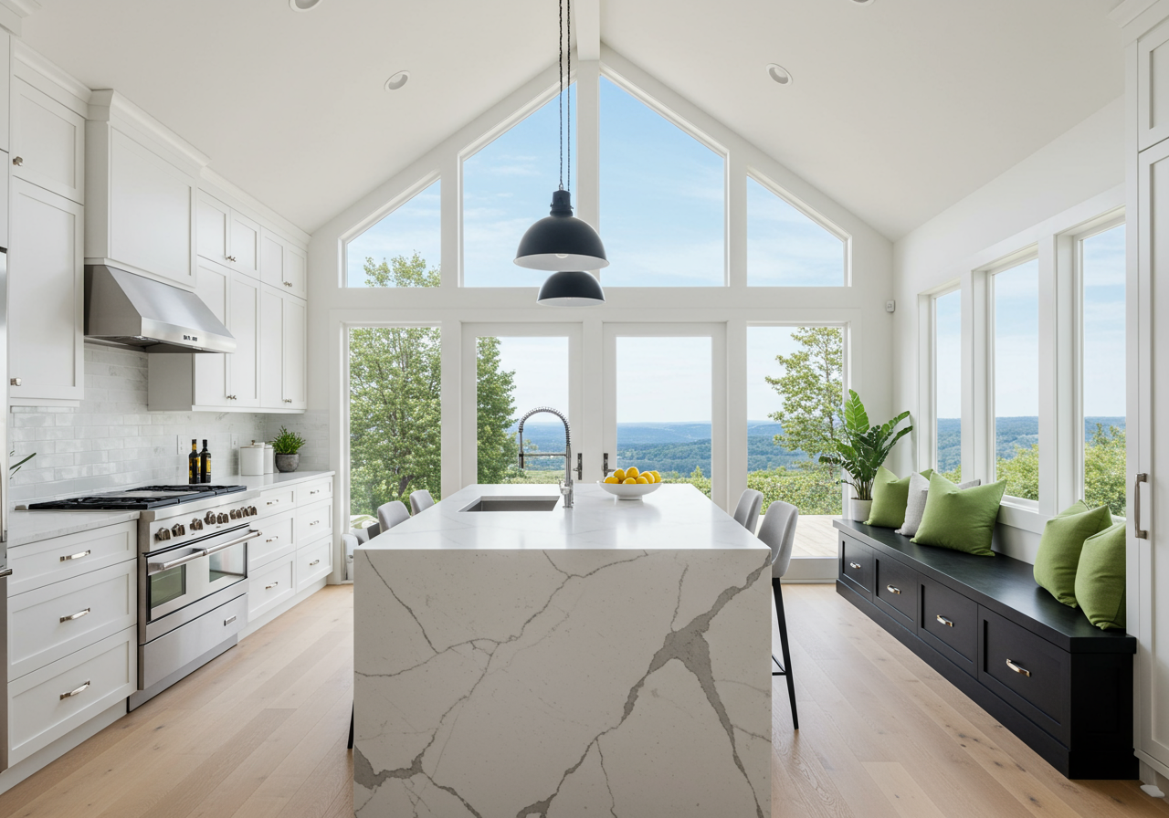
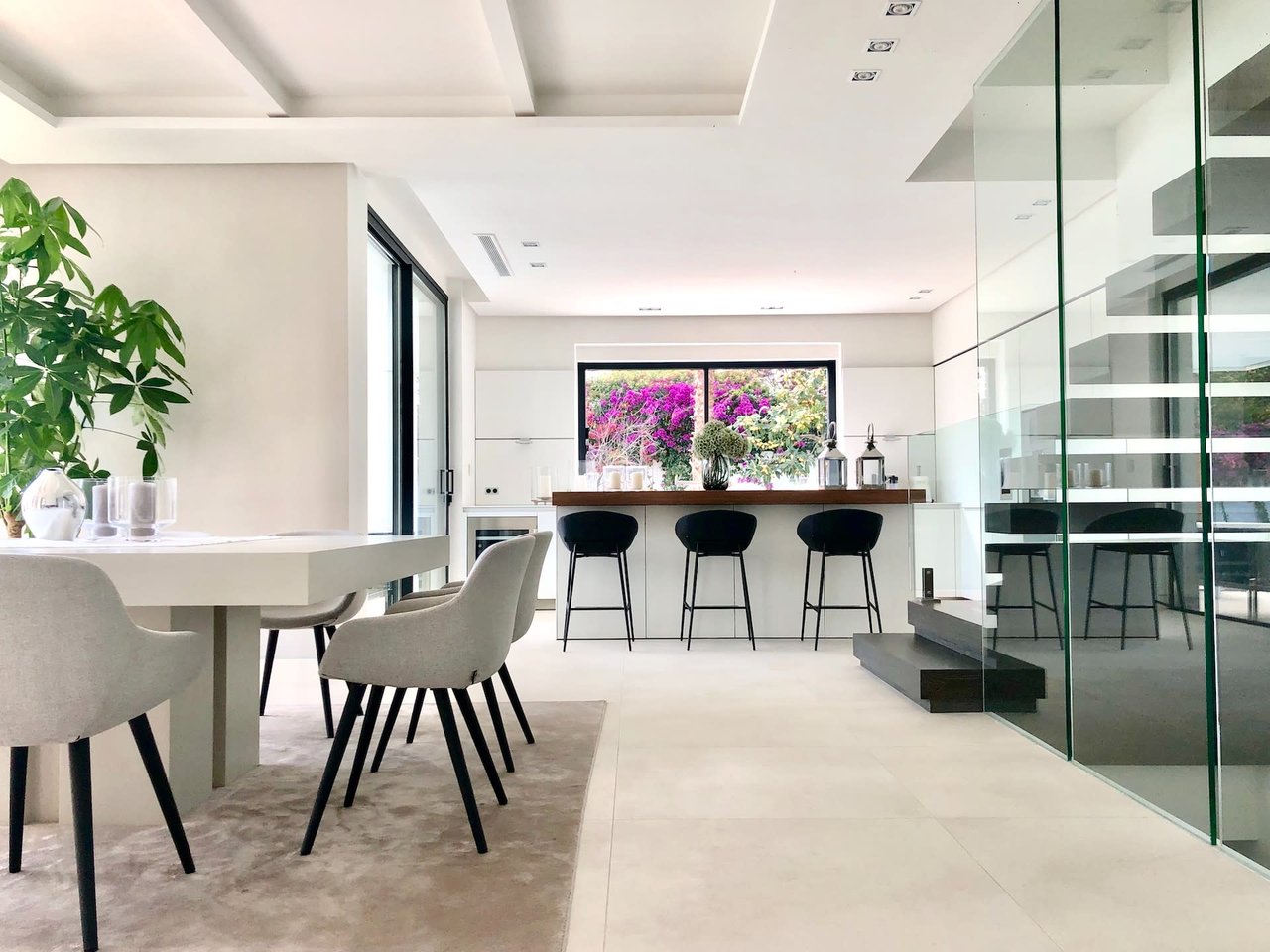
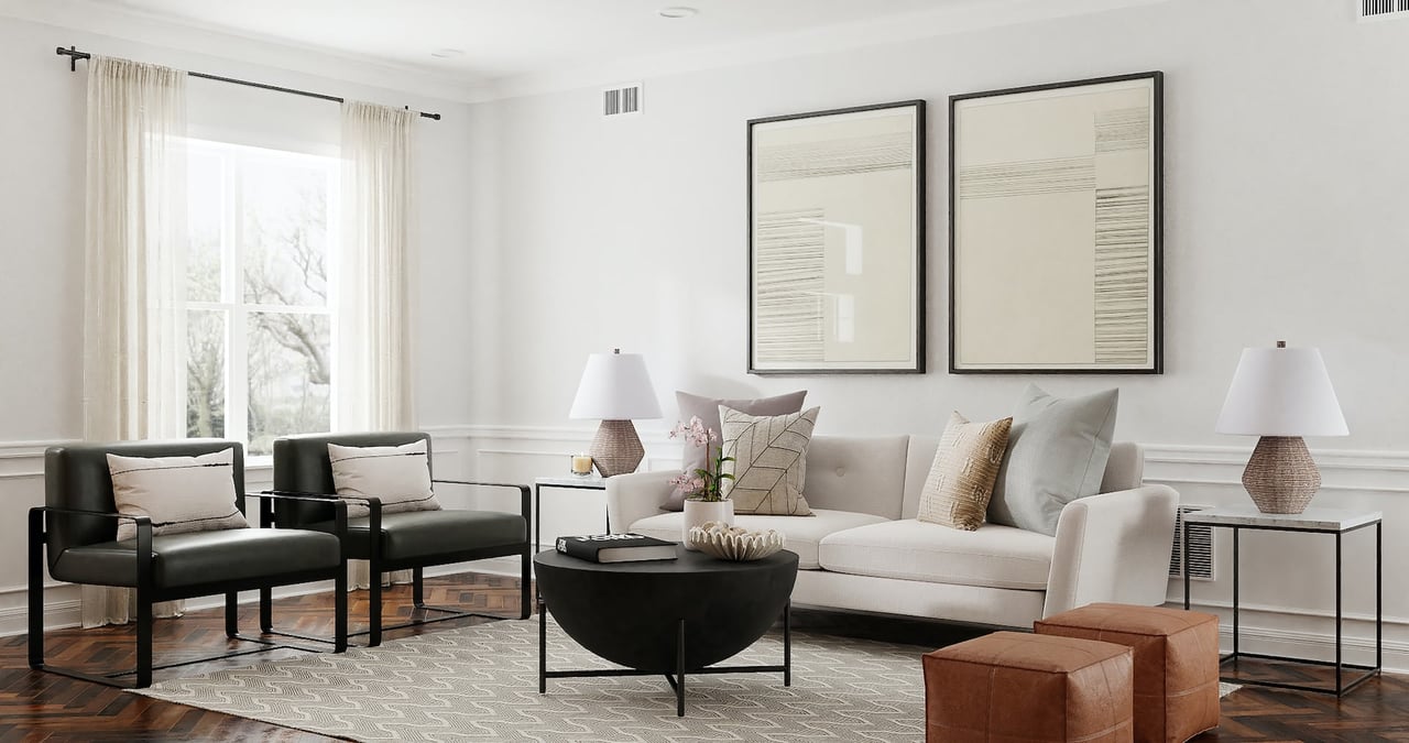
White works well with any accent color and may never go out of style. While it may seem like a ho hum choice at first, it’s perhaps the best color choice you can make. White rooms appear fresher and brighter, and you can pair white with any sort of design scheme. White walls function as a blank canvas that you can decorate with whatever accent pieces you desire.
For a slightly off-white color, choose a gray-white or even a gray-green. These colors work well in rooms that bring in natural light. White pairs especially well with wood floors and makes a great choice for freshening up an older brick fireplace.
Beige is a good choice
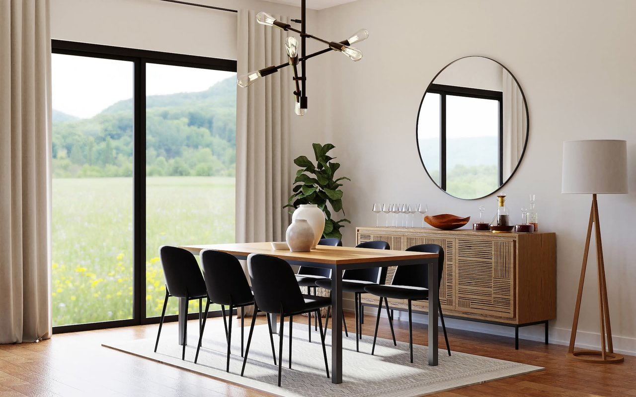
Perhaps white isn’t your ideal choice and you love the warmer tone that beige provides. Beige does a good job of complementing darker cherry and mahogany woods, and it helps these materials show off their richer undertones. Another popular color for owners of Mint Hill real estate is greige, which is a combination of gray and beige. This neutral color functions well with many designs and styles. Beige can also be used to touch up lighter wood. While most shades of beige make excellent choices, you probably want to stay away from builder beige if possible. Rooms painted with this color can often appear darker. For a similar appearance without the darkening effects, look at white-gray instead.
The many tones of gray
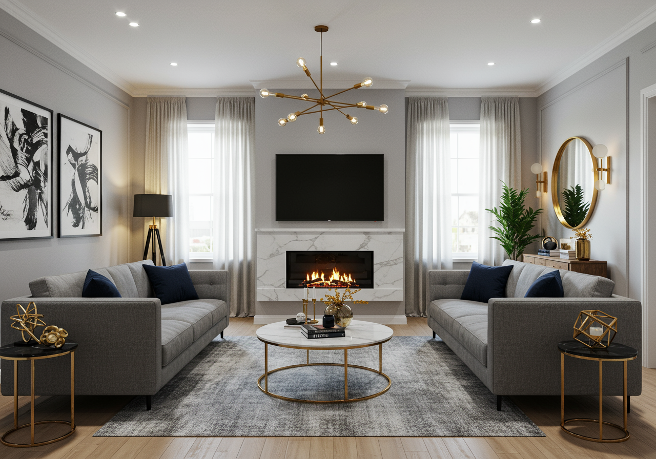
As much as designers love white, gray may soon pass it as the most popular choice for homeowners and designers. Gray comes in a variety of shades and it’s easy to layer multiple colors to provide greater contrast or texture. If you have brown floors or furnishings, you can use a gray with hints of blue or green to provide a greater contrast and help these colors pop. For a bold statement, choose a darker gray, especially if you have antique furniture in your space.
In warmer climates, many people opt for a lighter gray because of its cooling effects. In addition, it helps people relax and softens the overall ambience in the room. Gray helps hide obvious flaws on your wall so that they are less noticeable. Although neon is a popular color now, many designers advise choosing soft gray instead. It is a more relaxing and serene color.
Blue makes the list
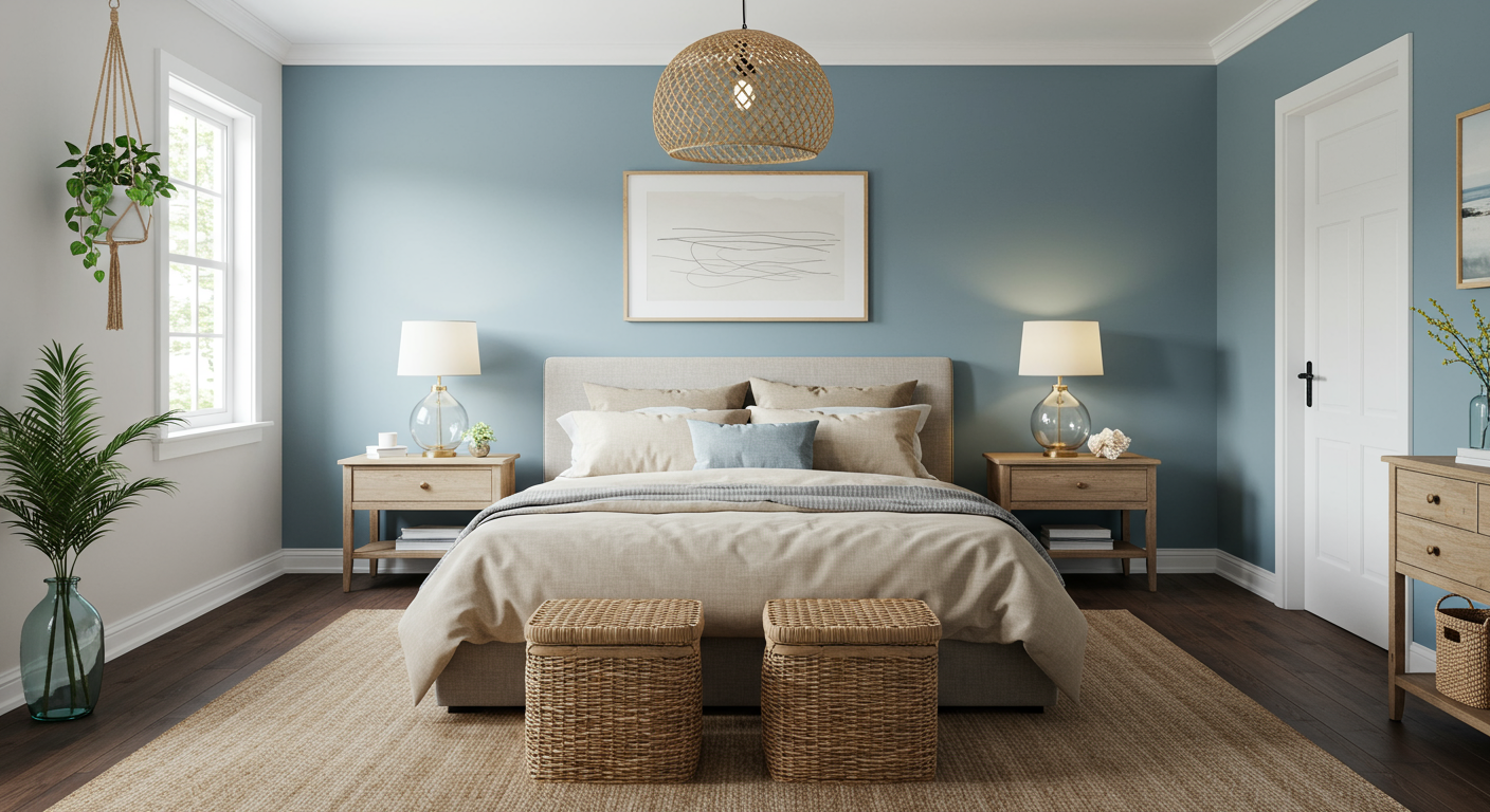
If white, beige, and gray are too unremarkable for you, perhaps you’ll paint your walls with blue. Blue tends to be a crowd pleaser, since many people name it as their favorite color. Blue works well with wood tones, and it provides a flexible background when you’re ready to change styles and aesthetics. Darker shades of blue are a better choice for painting cabinets, and if you want to bring more energy into a room, aqua blue might be your best bet. While some people find royal blue a little too jarring, cornflower blue provides a similar look without appearing overly dark or light on your walls.
Green is tranquil
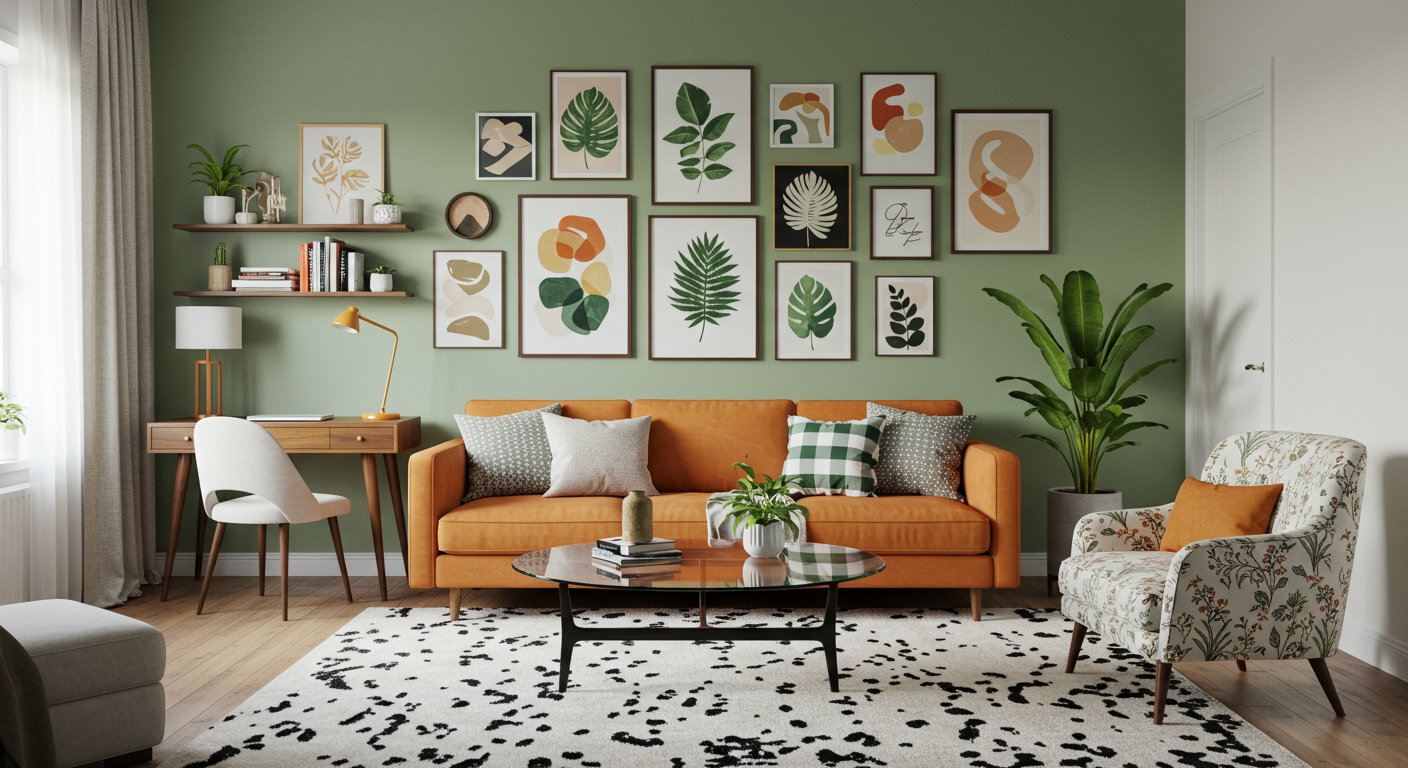
Green pairs well with wooden floors and furniture without sitting too heavy on your wall. Green tends to be highly versatile and works well with a variety of design styles. Many people feel that green walls make rooms more soothing and relaxing, which is why you’ll often see bedrooms painted green. If there’s a shade of green to avoid, it might be lime green because of its tendency to hold too much light.
Use red sparingly
Red is the first color on this list that you’ll want to stay away from. Something about the color red triggers an emotional reaction in most people’s brains and causes their heart rates to speed up. Red also commands greater attention, which is why stop lights and stop signs are red. For these reasons, you don’t want to paint your bedroom red; you might have a harder time relaxing. You don’t have to eliminate all red furniture or accent pieces from your room, but they will work better if you pair them with a calmer wall color.
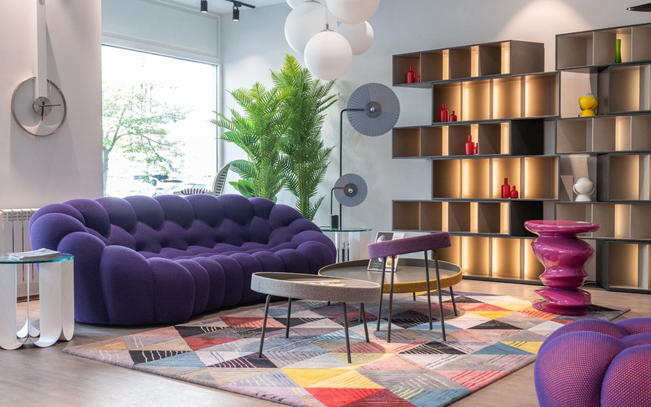
Avoid purple
Research shows that people usually don’t sleep well in rooms with purple walls. This color does not do a good job of facilitating a good night’s sleep, and it may even cause nightmares in some cases. Purple might be the color of royalty but it’s not an ideal choice for your bedroom walls.
Pink – as an accent
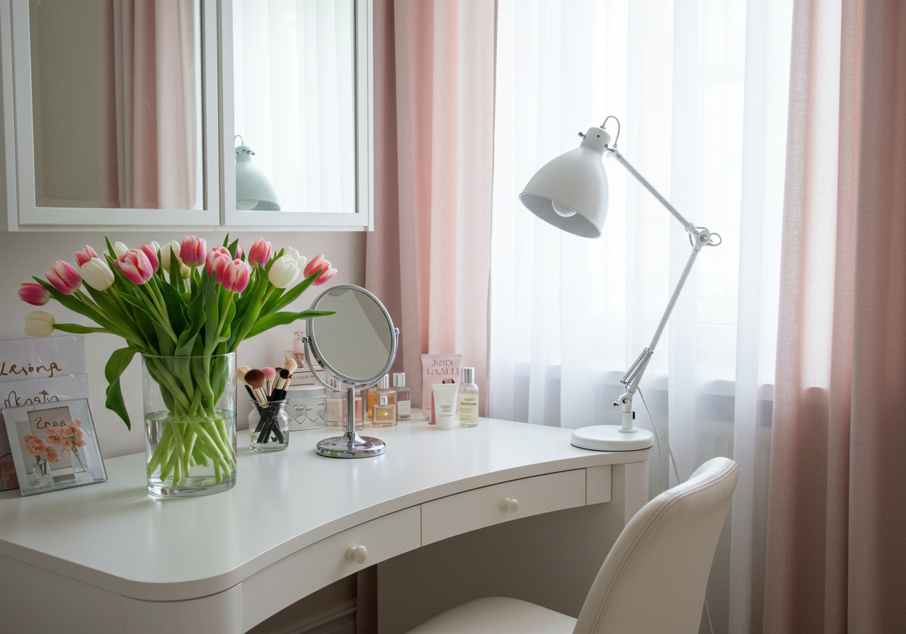
Pink works well as an accent color, but probably isn’t the best choice for a primary color in a room. It tends to overshadow other decorations and accent pieces. If you have a room that is entirely pink, it’ll be hard to notice anything else.
Pamela Roberts has many years of experience buying and selling homes in the area. If you’re selling a home and need guidance on improving its aesthetics with color, she’d love to help. Or if you’re looking to buy a home in the Mint Hill real estate market, contact Pamela Roberts for guidance throughout your journey.
*Header